WPS Prime alters the Visual Composer builder to use custom components and custom front end architecture and this way we get rid of the huge amount of front end inline styles that are generated using the default VC elements and construction method.
Heading
- Heading Text
- Size
- Link
- Link target
- Color
- Font Weight
- HTML Tag
- Text align
- Custom CSS class
- Custom CSS id
Image
- Image
- Image Size
- Alignment
- Image link
- Link target
- Custom CSS class
- Margin
- Padding
Divider
- Divider style
- Custom CSS class
Icon
- Icon library ( Font Awesome | Typicons | Woo E Commerce | Linecons )
- Icon
- Icon size
- Center: ( true|false )
- Custom CSS class
- Custom Icon Wraper css class
- Margin
- Link
- Link Target (default|_blank)
Video
- Video Link
- Custom CSS class
Text Block
- Content
- Custom CSS class
- Margin
- Padding
- Background Effects
- Text Color
- Text Alignment
Styled List
- Bullet Style
- Bullet Color
- List items bottom border style
- Content ( <ul><li></li>….</ul> )
- Custom CSS class
Anything Slider
- Scrollbar visibility ( true|false )
- Pagination visibility ( true|false )
- Single slide settings:
- Slide – Custom CSS class
- Slide – Background image
- Slide – Content
Accordion
- Autoclose ( true|false )
- Openfirst ( true|false )
- Open All ( true|false )
- Click to close ( true|false )
- Scroll ( true|false )
- Custom CSS class
- HTML tag ( set tab title html tag )
- Single accordion item settings:
- – Title
- – HTML tag ( set tab title html tag individually )
- – Icon ( custom icon before the tab title )
- – Content
Tabs
- Single tab item settings:
- – Title
- – Open ( set default state )
- – Icon ( custom icon before the tab title )
- – Icon custom CSS Class
- – Content
Buttons
- Button link
- Button link based on page/post ID
- Button label
- Button Color
- Button Size
- Button Ghost ( true|false )
- Button aspect
- Button align
- Custom CSS class
- Link target
- onclick – event field
- Margin
- Padding
- Icon
- Icon position
Mediabox
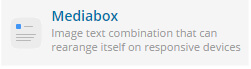
- Attach Image
- Image link
- Image size
- Image custom CSS class
- Icon library
- Icon custom CSS class
- Media Type
- Media Spacing
- Media order reverse
- Not Responsive ( true|false )
- Content
- Mediabox wrapper class
- Media type extra class
- Mediabox Margin
- Icon color
- Content color
Row
- Row horizontal align
- Row verical align
- Row columns spacing
- Custom row CSS class
- Add wrapper ( true|false )
- Wrapper CSS class
- Wrapper outer CSS class
- Wrapper outer ID
- Wrapper outer margin
- Wrapper outer padding
- Wrapper outer image
- Wrapper outer image size
- Background position
- Background behavior
- Use parallax ( true|false )
- Background effects
- Use video background ( true|false )
- Add Youtube link
- Add self hosted video ID
- Video background placeholder image
- Equal height columns
- Full-screen height row
Column

- Width
- Responsivness (width settings based on device width )
- Column itemCSS class
- Column item inner element CSS class
- Content align
- Set margin
- Set padding
- Set item inner margin
- Set item inner padding
- Background effects
- Background Image
- Background image size
- Background position
- Equal height columns